It was years ago. The A’s motto starts the ABC of design principles, drawn up by the letter’s designers. The sentence that followed it, ‘to not only see things as they are, but also to see them as we are,’ is usually found as an imperative, but I liked this more ambiguous version. In these tech-heavy times, it is certainly important to impress upon whoever needs to learn it, still: technology is not neutral. As, neither are we. So why the ambiguous ‘also’? It easily invites the scorn of those who think what is says is criminally naive: who thinks they can observe any thing as it is? Well, I had to learn what that means. I’m not sure the lessons ever end. For me, that fact is also expressed in the sentence. A for Awareness.
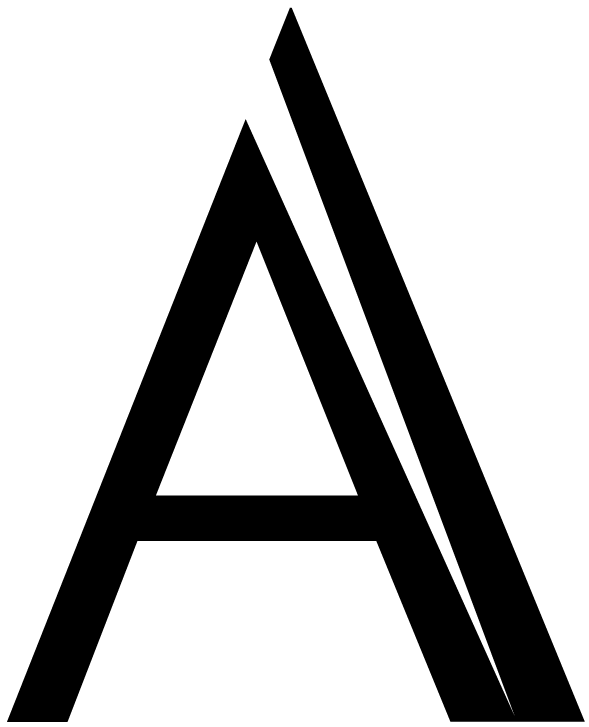
This strong A, struck by lightning and better for it, caught my eye before the motto did. I had developed certain skills of forgery during my filmmaking years. I falsified paper: newspapers, driving licenses, branding, passports, death certificates. The study of paper artifacts instilled a high regard for the art and craft of font design. For one movie set in the past, I got to design a newspaper that was printed on a press that went into a museum afterwards. I still have the plates.